Showing posts with label lettering. Show all posts

Sunday, September 11, 2011

Letterpress Printing - an intro

Letterpress from Naomie Ross on Vimeo.

This nicely made video provides a great overview of letterpress printing in less than two minutes.

If anachronistic and custom small press printing designs appeal to you, check out this site for inspiration and free downloads.

Thursday, May 19, 2011

Chalk Lettering to Keep

With chalk in hand, Dana Tanamachi creates elegant and refined custom lettering. I recently found her work and have been absolutely mesmerized by the beauty and lightness of her artistry. As faithful 973 readers know, I am always interested in typography and lettering, but finding a simple medium as chalk on a chalkboard made exceptionally stunning is truly brilliant. I hope you'll enjoy it, too.

Here's a time lapse video of Dana creating one of her pieces.

For more examples of her work see www.danatanamachi.com/chalk/

Saturday, April 23, 2011

Easter Greetings from 973


Vintage card images above and more may be found here.

Wednesday, September 30, 2009

Italic Handwriting


The back to school season is as good a time of the year as any to re-evaluate your handwriting. A recent op-ed in the New York Times challenged writers to stop mumbling on the page and drop the loopy cursive letters of the Palmer method or Zaner-Bloser style we were taught at small school desks with chunky pencils.

The new preferred style is Italic, in which letters do not always have to be joined. It's a matter of comfort and personal choice. The success of handwriting is its legibility. Oh, and closing the gaps on the tops of your letters, that's the part we read.

Click here for the NYT piece and a chance to try Italic.

For extra credit, take a free Italic handwriting lesson online here from studioarts.net.

Thursday, April 16, 2009

Groovy, Baby

I can't help but say "oh, groovy" each time I uncover this puzzle from the depths of my storage room. I am more tolerant of it now than when it was donated to me years ago from an older friend with a child born in the 70s. It was crafted and stamped Child's Play from Asheville, NC. I have a little trouble envisioning it as a toy that parents would embrace today for a young child. However, for an older child or adult of any age who is interested in retro fonts and lettering, it's a thoughtful re-gift.

Speaking of groovy fonts, here are a few I recently found at dafont.com:


Do you have a font or object that evokes groovy? Then by all means, please send it along to 973Third@gmail.com or leave a comment here.

We'd love to hear from you, baby!

Friday, March 20, 2009

Keep Calm & Consider Alternatives


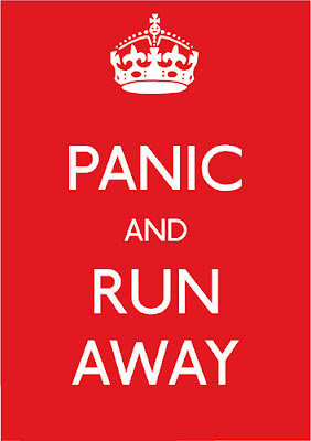
If the original Keep Calm and Carry On message doesn't suit you, here are but a few alternatives to consider:


For more info on any Keep Calm and Carry On parody featured above, just click on the image. See the previous blog entry for the story of the design sensation and original WWII poster saved from obscurity.

Thursday, March 19, 2009

Keep Calm & Carry On

Keep calm and carry on is a great message and a very timely one for us at this exact point in history. It's also a great poster design. The baronial graphic of the crown and the clear Gill font in caps further expresses the simple focus of the message. Well, sure, we can be optimistic with such a thoughtful and charming mantra and a pleasing graphic design to view. I'm feeling better about the world already.

The timelessness of the message and the beautiful simplicity of the graphic elements do not reveal the artist who designed the poster. Now available throughout Great Britain on t-shirts, tote bags, tea towels and door mats, to name just a few, what little is known about it is that it was created as part of a British Ministry of Information propaganda campaign in August of 1939 to alleviate fear of a possible German invasion.

A series of three posters were created under the crown of King George VI, yet only the first two were widely released, appearing on billboards, train stations and shops throughout England. The third design, Keep Calm, was held in reserve, and, thankfully, never needed for its intended use.

Somehow, somewhere, a copy of the unused poster was saved for about 60 years. It resurfaced in a box of old books purchased at auction in 2000 by booksellers Stuart and Mary Manley of Barter Books in Northumberland. They hung the poster in their shop and started to research its origins. Frequent requests to purchase it led them to reproduce the poster and offer it for sale. Some 40,000 copies have been sold through them.

In spite of its wartime origins, the message of resilience is welcome. The archives of British history and design gained a document almost unknown and the rest of us gain the benefits.

Special thanks to Jon Henley for his article Keep Calm and Carry On in the Guardian on March 18, 2009 and Mary Manley's blog entry on March 4, 2009.

Tuesday, March 3, 2009

Typewriter Style

The height of modern industrial design and portability were exemplified in this new design of the Olivetti Lettera 32 typewriter in 1963. Weighing in at about 13 pounds, this diminutive beauty was a great convenience for students and journalists. With a flick of a switch, the type changed from black to red or no ink for carbon copies.

Design conscious from early on, Olivetti was founded in Italy in 1908. From the 1940s to the 1960s Marcello Nizzoli, (1887-1969) one of Italy's most influential designers, directed product design including the iconic early Letteras. In addition to his role as head product-design consultant, he also worked for Olivetti as an architect, designing housing for employees (1948) and office buildings (1960s).

Click here for a delightful gallery of Olivetti's portable typewriters at the Portable Typewriter Reference Site.

Below are some vintage images of earlier brands of typewriters and their typists/writers and assemblers.
Typing pool, circa 1890

Sales office, circa 1900

Assemblers, circa 1911

These images appear courtesy of The Virtual Typewriter Museum. Please click on over to see all their collections.

Back at 973, the little Olivetti sits out with a piece of paper in the roller at the ready. The grocery list grows; a reminder to return a call is added; and other terrifically important notes are kept in one convenient place in our writing machine.

It's still a great way to communicate!

Saturday, February 28, 2009

Handwrite Your Own Font

Despite warnings that neatness counted and penmanship was graded alongside academic subjects in school, the best handwriting from my pen or pencil ended up closer to chicken scratch. Now I've revisited my sloppy curves and uneven squiggles in an attempt to tidy up my handwriting to create a legible font.

YourFonts is a web-based tool that transformed my combo print/italic scribble-scrabble into a TrueType font free of charge. The process is simple and easily accomplished with a printer and scanner nearby. First, download the pdf template. Second, neatly fill in each box, staying clearly inside the designated boundaries. Third, scan the completed template and upload to YourFonts. Fourth, preview and download your new personalized font.

No more excuses for not writing a personal note!

Thank You

Welcome to our clever crafting friends joining us from One Pretty Thing and Rachel's treasure trove of enticing projects at Daily DIY.

From the traditional craft of quilling papers into beautiful letters to the more immediate gratification of making your own handwriting into a font, the limits of lettering, typography, and design continue to intrigue us at this address.

Tuesday, February 24, 2009

Illuminated Letters


Lettering by hand with serifs and flourishes embellishes your message with beauty, creativity, and thoughtfulness. But you do not have to be an accomplished calligrapher to put together a monogram or a mini missive in a quilled alphabet as illustrated above and below.

The art of quilling or paper filigree is versatile and forgiving for the beginner. For starters, quilling is easy to learn and doesn't require a large investment in tools. Click here for more details on basic quilling instructions.

Shaping letters works best if you curl your paper strips first to condition them. Enlarge your alphabet pattern to the desired size and cut your strips to the approximate length needed for each part of the letter. Shape your strips over the pattern to match the curves of the letters. Glue together the strips as needed to form a single letter. When dry, glue the edges onto your card stock to finish.

For many more great ideas on this paper craft I recommend checking out The New Paper Quilling by Molly Smith Christensen.

Images courtesy of Molly Smith Christensen and Lark Books